This magazine has clearly used the rule of thirds with the Q in the top and Lady Gaga's face in the top too, in the middle is her body and the main cover line and then in the bottom is some cover lines and just the bottom of the image. This makes the magazine more aesthetically pleasing to the audience and therefore they will pick the magazine up. The colour pallet for the magazine is red black and white with a grey background however this is not in the colour pallet, this colour pallet is used in most magazines as it helps the more important things in red stand out- such as the logo and some headlines to attract the reader. The main cover line is central to the magazine - naming the celebrity, it is also bold and larger than all the rest of the font on the magazine. there is only two fonts used on the front of the magazine this promotes less confusion to the reader and also it makes it clearer what is the coverline and what is less important on the front cover.
There is also a barcode on the bottom right of the page and this is important as it will say the date and the price of the magazine and therefore will show the reader affordability and it will be able to be scanned when buying. The main image on the magazine is central to the magazine and is a famous celebrity and therefore more people will know her and therefore will sell more copies, also she is looking straight into the camera and therefore creating a relationship with the audience and using synthetic personalisation to aim this at the target audience. The masthead of the magazine is the title of the magazine which is slightly covered by the celebrity which is okay as it is a well known magazine and a well known celebrity and therefore will sell more copies if seen more. The centre of visual interest is the image of Lady Gaga and this is good as she is well known by all of the main audience, this is because it is central and it will interest the audience.
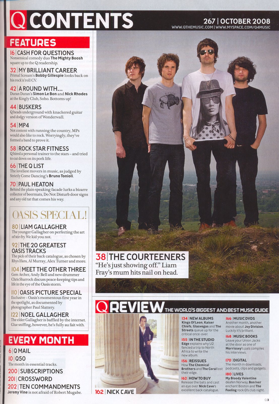
 Contents page:
The centre of visual interest on this contents page is the image of the band this is because it takes up most of the page and is the most colourful thing on the page. I think that they have done this because this is the thing that will interest the reader the most on the page and therefore they will automatically look at the band and what they are doing. The page is set out in columns and therefore makes it look more organised and clearer to the reader what to read and what is under which subheading. There is a masthead at the top of the page which is the title of the page and the date which is important that this is at the top to inform the audience what date the magazine was released and therefore how recent the information in the magazine is. In the contents part the subheadings are blocked out in a red background with white writing this makes it more eye catching for the reader and shows the importance of this, I like this technique and would like to use it in my magazine as it is interesting. There is also a callout under the image, to show why it is there, it has a quote from the band and which page you can find all of the information on, I like the idea of this as it is out of the column of the contents and it makes the page more interesting to the reader.
 Double page spread:
This is interesting as the title of the double page is very small at the top right hand side out of the way, I think this is because the main image takes up 1/2 of the double page and therefore the audience will already know what the article is about and what they are about to read. The colours on these pages are black and white, this creates an old theme about the image, also because Lady Gaga is looking straight into the camera it creates a personal relationship with the audience and also makes us feel as if we are looking into her life with the expression on her face, I think this is a good technique. There is a burst of colour on the two pages with the "L" which is large on the second pages, it is obvious what this stands for. This also interests the reader and draws them to the page.
Reasonable analysis Alice but not at the high level it could be. Better presentation, more detail in each and consideration of the actual article will all improve this.
ReplyDelete